Showing posts with label Technique. Show all posts

Tuesday, January 17, 2017

Love You Owl - Stamp Set


Love You Owl
This is my fourteenth owl illustration for Technique Tuesday.  His eyes are goofy.  I know. He's targeting you with his eyes for lloovvee. Ha!

I have two owls in the queue, one for March and one for April.  The March owl is holding a stuffed rabbit and he's a baby. Eek, I'm excited to share that one. I have a pen & ink drawing of the April owl idea on Instagram. That one is pretty normal but should be fun to color.

We made a bunch of projects last Tuesday with the new release. My friend Karen and I used this little cutie. There's a stamp set called You Aren't Normal that I think is perfect for all the things you REALLY want to say in a card! Karen used those sentiments on her card.
Love You Owl and You Aren't Normal Stamp Set

Tuesday, April 30, 2013

ARTIST TRADING CARDS STEP BY STEP

This is my water color technique!
 Step one: Sketch your subject in pencil.  This was an "April Showers" themed ATC (Artist Trading Card) Swap. Then I work on the background using watercolor washes.
I have a pre-cut ATC on hand to make sure I have everything centered and the right size (2.5 x 3.5 inch) for ATC's.
 Step two: I use permanent black ink (micron pens) to "ink" in the subjects. One umbrella, one tree and flowers. SO April! Then I color my subjects in with watercolors.
 Step three: I realize this umbrella is boring....
 Step four: I cut out rain drops from an old dictionary for the umbrella. Then leaves (circles) for the tree.
Just can't say "tree balls", sounds funny!
Step five: I used Pearlescents to add some shine on the "trees circles". More Pearlescents to the purple flowers. This adds some POP! Okay, not so boring.
 Step six: I use an ATC template to trace my 2 1/2 by 3 1/2 inch trading cards. That way I can center my subject just the way I want it.  Then I cut them out.  You can mount them on sturdier paper such as card stock or in the old days we used cereal boxes.  Unless you use a heavy weight watercolor paper.
Three finished ATC's! 

These are my two favorite Artist Trading Card swap sites.


For more information about an Artist Trading Cards click here: ARTIST TRADING CARDS

Friday, January 18, 2013

OWLS FROM OLD BOOKS

For this project I used an old phone book. I sketch the little owl with a permanent pen.  Usually I use a .03 or .05 when you cut the little guy out that thicker black line hides the rough edges the cutting blade leaves.

I use Pearlescent Liquid Acrylic for color.  My new favorite medium!

The opaque white is great when you need extra cover up.  I wanted his head to be super white.

I colored his eyes with glow in the dark paint.  SURE ENOUGH when you turn out the lights the little eyes glow!!

All done!
Happy In The Studio, PPF, Sweet Saturdays and Sunday Sketches!  Hugs :)

Saturday, May 12, 2012

MY WATERCOLOR PROCESS

First I get my drawing done with permanent ink so the water won't wash away the lines.  For paper, I always use Arches watercolor blocks.  They are great and won't buckle. This painting is called Kristen III.

Gather supplies!  Light source to the left, I'm right handed and I don't want shadows. Two things not shown but very necessary for me are a squirt water bottle to get the paint wet and tissue to slurp up water and mistakes.

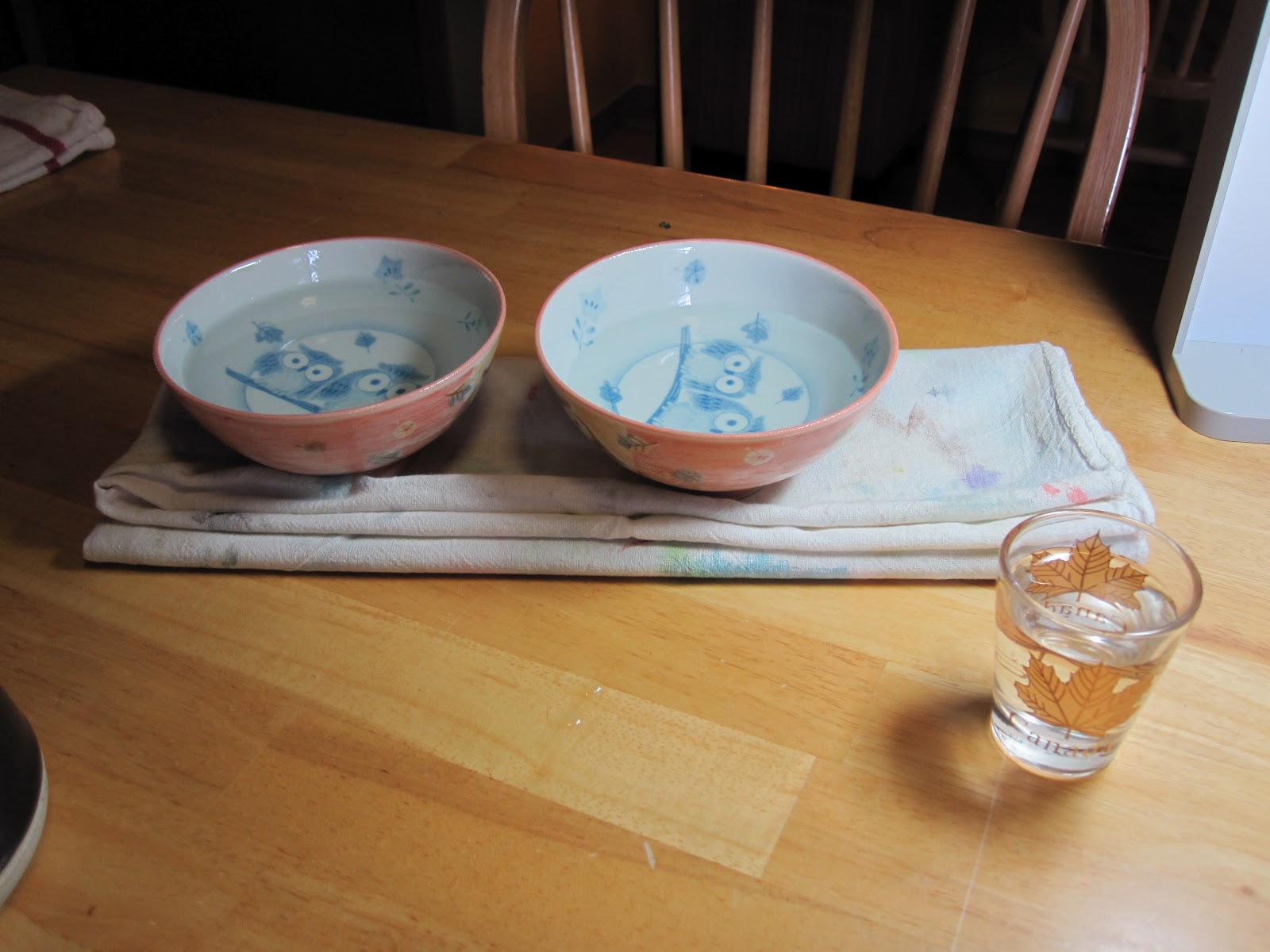
I use a three bowl rinse system.  First bowl for most of the paint, second bowl for an extra rinse and the tiny shot glass for "super clean never been touched by paint" water.  Aren't they cute...my little owl bowls?  Ya well......

My brushes, I have so many.  It's a mood thing for me.  Sometimes my cheap ones seem great and sometimes my expensive ones, I can't live without.

Watercolors!  I use M.Gram watercolors.  LOVE the quinacradone colors!

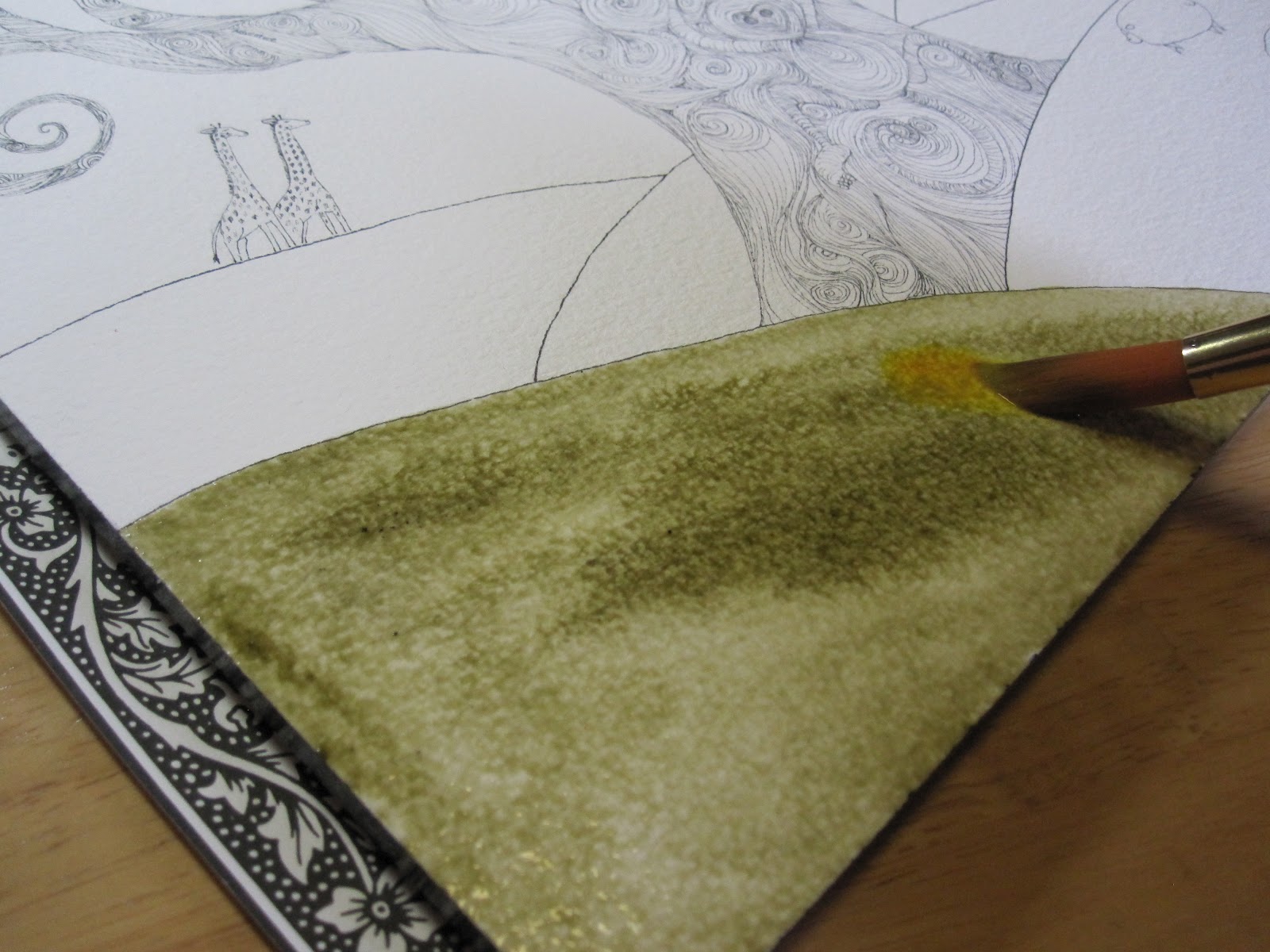
After I get the area wet that I want to work with on the painting, I spray the color, olive green with my water bottle, get the brush wet (wet on wet technique) grab some paint then apply the color to the paper. 

I try not to cover the whole area solid with the color.  Leaving some white space, darker and lighter areas of olive green, adds depth and texture.

Next I grab a different color, nickel azo yellow.  I didn't rinse the brush in this case.  Sometimes you do and sometimes you are okay with having green in your yellow. :)

I dipped the azo yellow into the wet olive green in different patches. 

I needed to create some more depth with shadow so now for the POP, turquoise!

I used turquoise on the left side, shadow side, of the hill.  My light source, in this painting, is coming from the right.

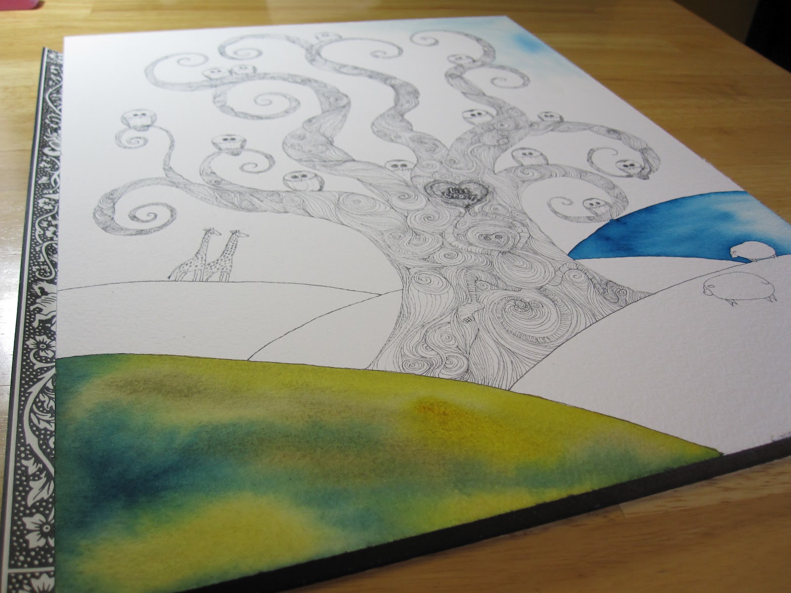
There all done!  Notice none of the color is solid.  Each color gets to peek through and add it's own interest.

To create some good color composition and continuity, I knew I would need to use the turquoise in other areas.  It's such a dark dominant color.

The hill off in the distance is a nice cool turquoise.  Not as many details or colors as it is father away in the landscape.

SO those cute little owl bowls...lets get real!  I need some big industrial bowls to get the rinse job done.  The rinsing of the brush is so important for the light colors.  You can get hard lines, blooms and muddy colors if you don't have well rinsed brushes.

I decided to go with a turquoise sky as well. 

Here it is!  All done.


Saturday, February 12, 2011

WATERCOLOR TREE BEGINNING TO END

I made a bunch of lightning like lines with watercolor pencil...

I made sure they were all square lines and smaller and smaller from the trunk to the branches. The smallest being flag looking branches(got to have the rules)...

I used two different colors of blue light and dark. Also a deep purple.

Then I ate smoked almond and some generic honey crunch cereal and watched CSI.

Finally I added water to the lines and scribbled the ground with blue and purple.
So that's it!  Paul calls this my blue cubism period.  I'm just getting this over all in one tree.  Not sure the period will last.  Got a green one started so that's next unless I get Kim done....she's almost done!